Your kitchen can act like a small brand — clear, repeatable choices help people recognize and trust what they see. Think of labels as part of your home’s visual identity: fonts, layouts, and placement that repeat make it easier to find ingredients and reduce mystery containers.
When you bring brand logic into the pantry, fridge, and freezer, you get faster grabs and fewer questions from guests. Brand consistency and repeated visuals build recognition and trust across platforms you use, from meal prep to shared shopping lists.
This guide walks you from the decisions you must make — repeated fonts, placement rules, and information order — to the tools and templates for daily use. Expect practical outcomes: clearer dates, neat containers, and a home that looks intentionally organized instead of random.
Use the tips here to set rules, pick materials, and keep files so your system stays simple and useful. In short, you’ll get a friendly, repeatable approach that others can follow with ease.
Why Consistency Matters for Kitchen Labels
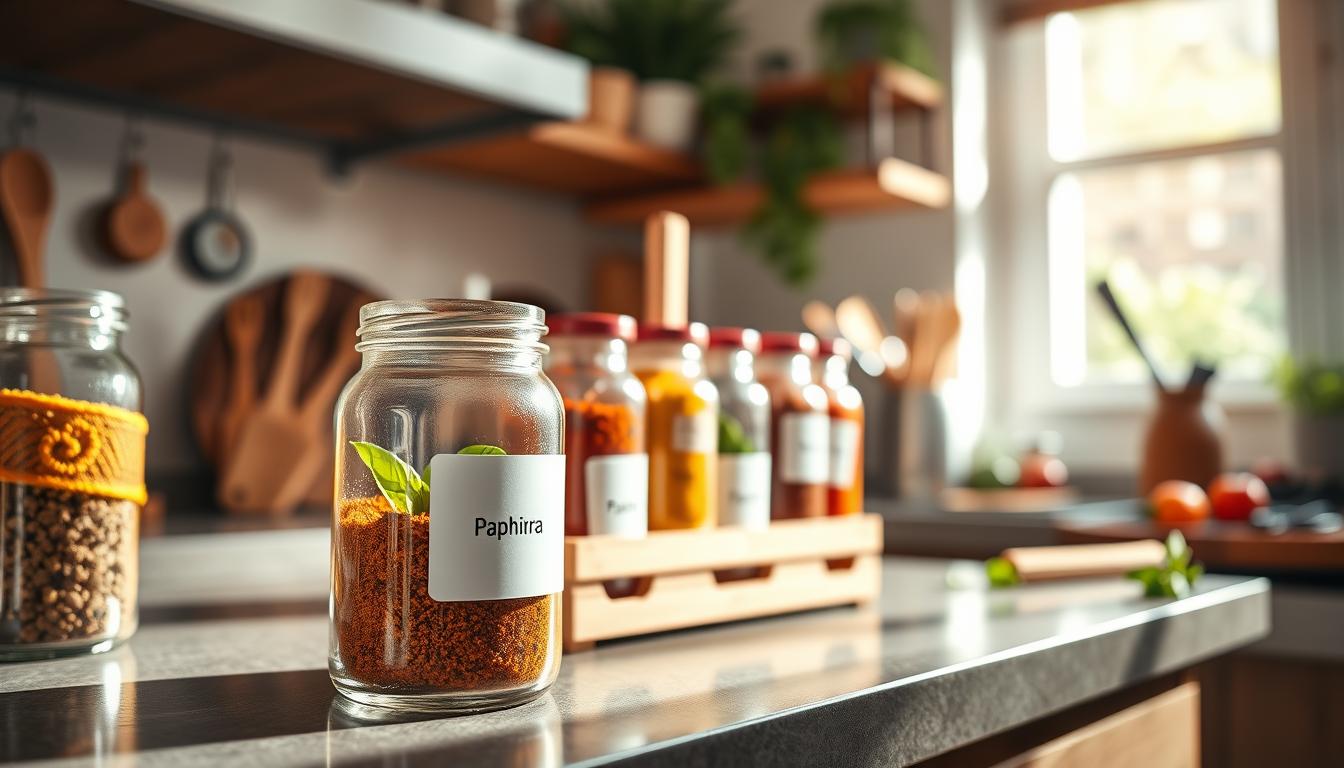
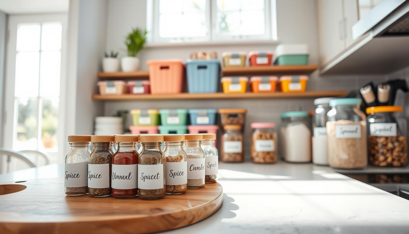
A clear label system turns a messy shelf into a fast, reliable way to find what you need. When your jars, bins, and drawers share the same rules, you build instant recognition and a more usable kitchen.

How repetition builds recognition, trust, and a polished look
Recognition comes from repeated fonts, colors, and placement. You learn to spot “Rice,” “Flour,” or “Oats” at a glance instead of reading every container.
Trust follows. People assume dates and allergen notes are accurate when the presentation is reliable. That reduces guessing and wasted food.
The overall result is a more polished visual identity: coordinated visuals make everyday jars feel curated, like a small home brand you trust.
What goes wrong when labels don’t match
Mixed names, different date formats, and near-matching graphics slow you down. Your household acts like an audience: inconsistent cues lead to hesitation and mistakes.
- Duplicate names (Sea Salt vs Salt)
- Mismatched abbreviations and dates
- Containers that feel like they belong to different brands
Consistency across zones isn’t perfection. It’s simple guidelines you can keep, so your system works for family and guests alike.
Define Your “Audience” and Use-Case Before You Label Anything
Label decisions work best when you define the real users and the tasks they’ll do in the kitchen. This step helps you match wording, materials, and placement to real needs so the system lasts.

Who uses your kitchen?
Identify your primary audience: family, guests, babysitters, and the future you who reheats leftovers. Knowing your target audience prevents mixed messages and saves time.
What are you labeling?
Map items by category: pantry staples, spices, leftovers, and cleaning supplies. Decide which content each label needs: name, purchase date, open date, use-by, allergens, or reheating tips.
Where must labels perform?
Plan for zones. Fridge labels face condensation. Freezer labels need frost-proof adhesive. Dishwasher-safe tags work for jars and reusable containers.
- Audience-first check: who will read this label and what do they need?
- Zone rules: pantry, spice rack, fridge, freezer — pick materials that match.
- Safety separation: keep cleaning supply labels bold and away from food.
- Quick checklist: audience, content, materials, placement, and tools for each new label.
Tie these choices to your home brand and brand image. Your brand personality and voice should guide design and messaging so the kitchen experience feels intentional and on-brand across platforms.
Create a Kitchen Label Style Guide That You Can Reuse
A simple document saves time by showing exactly how each label should look and read. Make a one-page reference you keep near the pantry so anyone can follow the same rules.
Core elements to standardize include three label sizes (small, medium, large), exact placement (front center, lid edge, bin handle), and a fixed information order: name, date, note.
- Pick size options and list where each belongs.
- Write placement guidelines for fridge, freezer, and pantry zones.
- Lock an information order to avoid mixed messaging.
Logo-free brand identity uses borders, a header bar, or a single shape instead of a logo. This keeps your visual identity warm and homey without feeling commercial.
Voice and tone rules should cover abbreviations (Exp, Use By), title case vs. sentence case, and friendly messages like “Refill me.” Keep wording short and predictable.
Finally, document best-practice examples—printed samples or photos—so you stop guessing and simply follow the guide every time.
Build Your Design System for a Consistent labeling style
A simple design system makes categories pop so anyone can find ingredients fast. Use clear rules for color, type, and layout to reduce guesswork and build trust in daily use.
Choose a color palette that signals categories at a glance
Pick a limited color palette and assign hues to zones: pantry, fridge, freezer. A tight palette prevents random marker colors and strengthens your brand identity.
Use color psychology to guide kitchen zones
Warm colors help quick-grab pantry staples feel energetic. Cooler colors cue freshness for fridge items. Neutral tones give premium or long-term storage a calm look.
Set font rules and an information hierarchy
Choose clear, legible fonts and set a hierarchy: large product name, smaller date and allergen fields. This makes content scannable and helps compliance-minded clarity.
Establish layout repetition and one practical example
Lock margins, spacing, and alignment so text and icons always sit in the same spot. For example, label a jar and a bin the same way: same color bar, big name on top, dates underneath. The result is faster recognition and more household trust.
- Apply one palette to avoid mixed visuals.
- Set font sizes for name, date, and notes.
- Repeat layout so items are spotted not read.
Standardize Templates to Save Time and Keep Everything On-Brand
Build a small template library so you don’t remake the same layout over and over. This saves time and locks in your home brand look across jars, bags, and bins.
Core template set to create
Make one template for each common container: pantry jars, spice lids, freezer bags, leftover containers, and baking bins. Keep these ready in your design files so printing is fast.
Reusable layout blocks
Design modular blocks: a header, a category color bar, an icon area, and a date field. Mix-and-match blocks to make new labels without breaking your rules for fonts or colors.
Workflow and practical example
Duplicate the right template, change only the product name and date, then print. That single step reduces revisions and limits “almost matching” labels that differ in spacing or wording.
- Where to allow flexibility: optional icon or short note line.
- Where to lock rules: font hierarchy, category colors, and logo placement.
- Quick example: use the same template for “Flour,” “Almond Flour,” and “Powdered Sugar” so names change but the design stays identical.
Templates are one of the easiest tools to maintain brand consistency across platforms and brands inside your home. They speed the process and keep your kitchen looking intentional every day.
Select Label Materials and Finishes That Match Your Kitchen Experience
Pick materials that echo your kitchen’s personality so labels feel like part of the room.
Decide first if your aim is minimalist, modern, rustic, or eco-friendly. Materials and finishes should support that persona. Matte vinyl reads calm and modern. Kraft paper feels rustic and warm. Waterproof film suits busy fridges and freezers.
Durability and daily wear
Think about moisture, heat, oil splatter, and frequent handling. Choose waterproof or coated options for fridge and dishwasher exposure.
- Matte vinyl: looks modern, resists smudges, lasts under handling.
- Glossy/waterproof paper: prints vivid colors but may glare in low light.
- Removable adhesive: ideal when you refill jars or change contents often.
Test samples before you buy a roll
Order small samples (UPrinting and similar vendors offer swatches). Test adhesion after refrigeration, freezer frost, and a dishwasher cycle.
- Fridge test: stick, chill 24 hours, check peel and legibility.
- Freezer test: freeze 48 hours, thaw, check for yellowing.
- Dishwasher test: hand-wash or run through one cycle, inspect edges and print.
Matching material choices back to your brand builds trust and brand consistency. A label that stays readable and intact signals reliability to customers, guests, and household members.
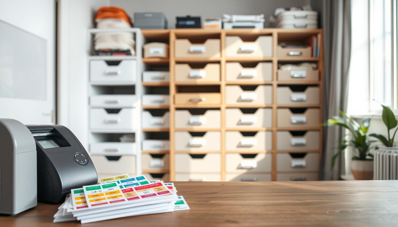
Organize Your Files and Tools So You Can Stay Consistent Over Time
When your assets live in one place, edits take minutes instead of hours. Set up a simple asset hub that holds templates, fonts, photos, icons, and the single logo file for your brand.
Folder structure: create top-level folders for Templates, Fonts, Images, and Exported Labels. Store platform-specific files (Canva, Figma, Adobe) in clear subfolders so anyone can find the right source.
- Name files with clear rules, for example: Pantry_Jar_2x3_BlackOnWhite_v3.png.
- Use shared drives (Google Drive, Dropbox) so files sync across devices and platforms.
- Keep one source of truth for fonts and design elements to protect brand consistency.
Pick tools that fit your comfort: Canva for quick edits, Figma or Adobe Libraries for locked colors and reusable design elements. These tools speed the process and reduce drift from your guidelines.
Version control tip: keep a short change log. Example entry: 2026-03-01 — Updated header color to Pantone 7499; reason: better fridge contrast. This habit saves time and keeps messaging and tone aligned across all content.
Roll Out Your System Across the Whole Kitchen Without Creating Chaos
Rollouts work best when you move slowly, zone by zone, so the kitchen stays usable while upgrades happen. Start from a consistent foundation, then expand, testing small changes as you go.
Start with high-impact zones
Begin in the pantry, then do the spice rack, and finish with the fridge and freezer. This phased approach avoids a weekend-long mess and fixes the areas where wrong labels cost you the most time.
Apply category rules across surfaces
Use the same category rules for shelves, drawers, and containers so baking looks like baking no matter where it lives. This consistency across zones boosts recognition and saves seconds at every meal.
Keep flexibility inside guidelines
Set a simple relabeling workflow: remove old tags, clean surfaces, apply new labels in the same spot, and update templates if a rule improves. You can test a new icon set or tweak wording, but keep fonts, hierarchy, and palette locked.
- Quick palette example: Snacks—yellow, Grains—green, Baking—blue, Breakfast—orange.
- Onboard your household with a visible rule card in a cabinet so your audience adapts fast.
Follow these practical tips to protect brand consistency, speed up finds, and build trust so customers and family alike stop asking, “Is this cumin or chili?”
Conclusion
A short maintenance plan keeps your kitchen identity practical and lasting. Recap the system: define your audience and use-case, create a reusable style guide, build a design system, standardize templates, pick durable materials, and organize files so edits take less time.
Your work pays off in faster finds and clearer decisions. Predictable layouts and labels build brand recognition and trust, which make daily routines smoother and your home feel more intentional.
Keep one habit: update the style guide whenever you change colors, fonts, or layout rules. Small edits save hours later and protect brand consistency across labels and templates.
Next step: pick one zone this week—pantry or spices—apply your template set, and expand when it feels effortless. The result is a kitchen that matches your personality and identity, looks polished, and saves you time every day.