When you pick a finish for your jar, the core question is simple: when does a clear film give you a “no-label” aesthetic, and when does a solid panel make your branding pop on shelf and in photos?
In practical terms, the phrase compares how a shopper sees your packaging from a few feet and how they read fine print up close. Clear constructions use a film facestock, a haze-free adhesive, and the right liner so graphics seem to float. Those parts matter.
Better depends on the jar (clear, amber, frosted), your product color, and how much information you must fit on the surface. We’ll weigh design, readability, perceived quality, durability, and application risk like bubbles or wrinkles.
Later in this guide you’ll get printing realities—white ink layers, color washout, and gloss versus matte—and category tips for food and beauty. For a short takeaway: if your product’s color is an asset, transparency can elevate it; if bold branding and legibility lead, opaque often wins.
What transparent and opaque labels mean for glass jar packaging
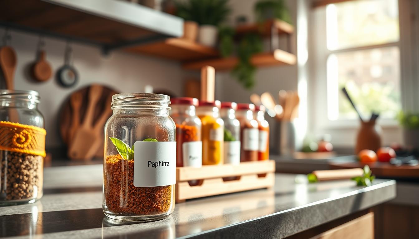
Choosing a label style changes how your jar reads on shelf and in photos. A clear label uses a transparent film facestock, a pressure-sensitive adhesive, and a liner so print seems to float on the jar. That setup aims to show your product first and your brand second.
Clear labels and the “no-label look” on glass
With clear labels, unprinted areas are truly see-through. The jar’s glass tone and product color become visible parts of the appearance. On a clean, smooth surface the printed art can look like it’s printed directly on the glass.

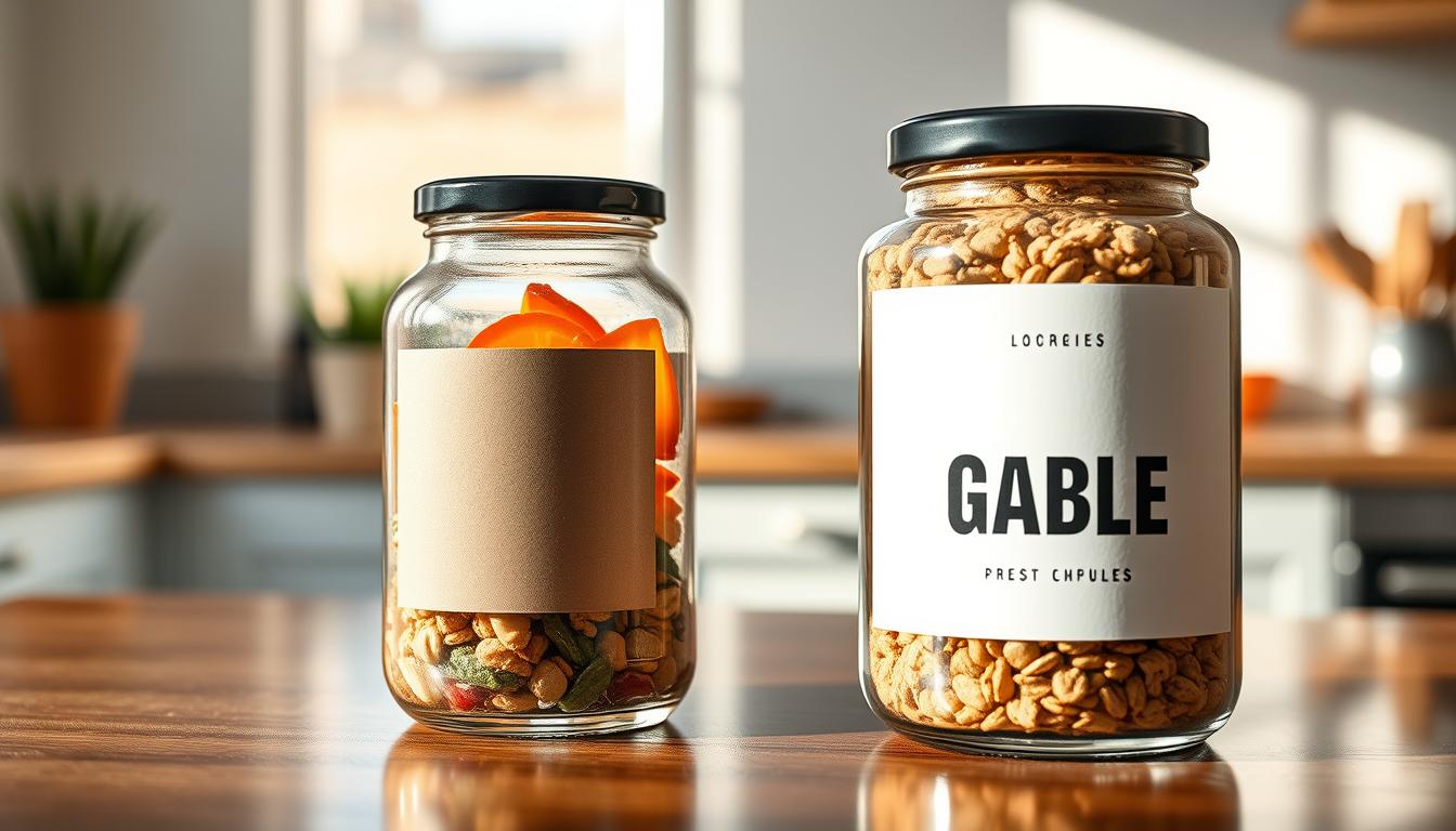
An opaque panel creates a strong, consistent reading field. Solid white or colored panels improve contrast and make information like barcodes and directions easier to scan at a distance.
When jar, color, and texture become part of the design
Texture—spice flecks, honey viscosity, scrub granules—adds tactile storytelling that can set your product apart. But if color varies between batches, a transparent label can yield inconsistent shelf looks. Also note: surface cleanliness, curvature, and smoothness affect final adhesion and the visual effect of a clear film.
- Minimal, see-through styling highlights product color and texture.
- Solid panels favor fast recognition and dense information blocks.
- Assess your packaging goals before choosing a route.
Transparent vs opaque labels: which looks better on glass jars for your product?
A simple design choice—letting the product show or creating a bold plate—can steer buyer trust and recognition.
Minimal, premium aesthetics vs bold, graphic branding
Choose clear printing when you want a refined, minimal look. Letting the jar contents be visible makes the product the hero. This works well for vibrant foods, modern skincare, and premium beverages.
Pick a solid panel when you need instant readability and strong branding. A bold graphic field improves contrast and helps shelf recognition where many products compete for attention.

How transparency affects perceived product quality and trust
Seeing texture—seed specks, oil clarity, or layered color—adds authenticity. Clear printing can signal honesty and purity because shoppers can inspect the contents before purchase.
Conversely, a full panel can communicate craftsmanship or heritage when paired with classic typography and color. That approach suits darker or messy products, or when you must fit dense regulatory text.
- When product appearance matters, favor a see-through approach.
- If legibility and bold branding matter most, choose a solid panel.
- Match your choice to price point and retail channel to reinforce expectation.
Both routes have real benefits. Keep in mind the final look can shift after printing if you don’t plan for contrast, ink behavior, and finish—topics we cover next.
Design and printing realities that change the final look
How a printed panel interacts with the jar’s fill often changes the final look more than the art itself. Product color can shift printed colors on clear film, especially pale inks. That shift can make text and graphics appear faded or muddy on glass jars.
Why product color can wash out your artwork on transparent surfaces
Unprinted areas let the fill show through, so mid-tones and light hues lose contrast. Lighter ink tints are most at risk of disappearing when the jar contents are similar in hue.
Using a white ink layer to protect contrast and readability
Apply white ink as a full flood or spot underprint to block show-through. In production, the white ink layer acts as an opaque base under CMYK or spot colors so your brand colors remain true.
Choosing color palettes that stay legible on clear film
Favor high-contrast combos and darker text. Avoid mid-tone palettes that match common product fills. Make sure you proof on the actual jar and light conditions before final print.
Gloss vs matte finishes and the visual effect on glass
Gloss boosts shine and color depth but can show fingerprints and reflections. Matte softens glare and can feel premium, though it may reduce sparkle from the glass. Choose finish based on how you want the product to read in photos and on shelf.
- Practical tip: Test proofs on filled jars under retail lighting.
- Design outcome: Correct printing choices reduce returns and readability complaints.
- When to embrace translucency: Use it as an effect, but block it for compliance-heavy panels.
Label materials for glass jars: clear film, paper, and performance tradeoffs
Different materials change both the look and long-term performance of your jar artwork. Choose a facestock that matches how you want the product to read and the conditions it faces.
Clear PP/BOPP film for high-clarity “label disappears” results
Clear BOPP (biaxially oriented polypropylene) gives excellent clarity and stiffness. It helps the printed film sit smooth on curved glass so your graphics seem to float.
It’s cost-effective, print-friendly, and resists moisture and tearing—good for pantry items and refrigerated jars.
Clear PET film when you need added stability and durability
Clear PET offers stronger dimensional stability and higher temperature tolerance. Choose it when you expect stretching, hot-filling, or long-term shelf life.
What facestock means and why it matters
Facestock is the top material you see and print on. It largely determines gloss, conformity to the surface, clarity, and cost.
Durability factors and real-world water scenarios
Consider moisture resistance, abrasion resistance, and yellowing. Film materials resist water from condensation, sink-side use, and steamy bathrooms better than paper.
Match material to the range of conditions: ambient pantry, cold chain, or repeated handling. That choice preserves appearance and reduces returns.
- Film = clarity and moisture protection.
- BOPP = “no-label look” and easy application.
- PET = stability for tougher conditions.
Adhesives and liners that keep labels looking clean on glass
Adhesive and liner choices determine whether your artwork reads like glass or looks fogged.
Even the best facestock can go soft if the glue hazes on the jar surface. For clear labels, pick a haze-free, visually transparent adhesive so the no-label effect stays convincing.
Why clear adhesives matter
“Water-white” acrylics block clouding and keep printed areas as clear as the surrounding glass. That preserves contrast and makes the clear label look intentional, not damaged.
Moisture, condensation, and real-world performance
Cold storage and temperature swings can stress adhesion, cause edge lift, or reveal whitening. Match adhesive chemistry to your product’s range — pantry, fridge, or ice-bath promos — to avoid late failures.
Liners and smooth dispensing
The liner supports printing, converting, and application. PET liners give top-tier clarity and consistent release for high-speed runs. Glassine is cost-effective for small batches when extreme clarity isn’t required.
- Practical tip: Test the exact construction (facestock + adhesive + liner) on your filled jar under condensation before you commit to volume.
- Outcome: Proper materials and process reduce wrinkles, edge lift, and rework during application.
Application on glass jars: avoiding bubbles, wrinkles, and misalignment
A careful application routine is often the difference between a crisp brand display and a jar that looks unfinished.
Surface prep basics
Start with clean, dry glass. Remove oils and dust with isopropyl alcohol and lint-free cloths. Control temperature so adhesives tack consistently.
Make sure placement is standardized. Use a jig or guide to land the label the same way every time to save time in production.
Why air pockets and flaws show through
Clear film reveals any trapped air or dust because you can see into the void. That makes bubbles and tiny wrinkles far more noticeable.
To reduce defects, make sure you test the application process on filled jars before full order runs.
Practical tactics and machine considerations
- Hand or dispenser: use firm, even squeegee pressure and steady speed to push out air.
- Adjust dwell time so the adhesive bonds before you finish smoothing.
- For tapered or embossed jars, pick a conformable film and test angles to avoid lift.
At high speeds, control label stiffness, alignment tolerances, and dispenser stability to cut rework time. Whether ’re applying by hand or machine, a small pilot run will catch issues that only appear on filled glass—and protect the final look of your product.
Choosing the right label for your jar type, category, and brand goals
Start by listing what matters most: product appeal on shelf, required information, and brand consistency. That quick checklist steers whether you highlight the fill or prioritize a solid reading field.
Food jars: show texture and meet requirements
For many food products—honey, jam, sauces—letting color and texture sell works well. Use high-contrast type and white underprints when you must include ingredients or nutrition panels. That keeps the product visible while preserving legibility.
Beauty and personal care
If your products rely on a clean, modern look, see-through film can signal purity. For richer formulations or to hide inconsistent fills, choose a solid finish to read consistently across SKUs.
Branding strategy and practical benefits
If your story is “nothing to hide,” transparency supports trust. If bold branding drives recognition, a solid panel gives stronger contrast and easier shelf blocks. Labels offer SKU harmonization and faster seasonal swaps when planned well.
Cost, ordering, and a quick buyer checklist
White ink, specialty films, and finishes raise costs and add production time. Lead times and minimums change with material and print steps.
- Checklist: product type, required information, brand goal, budget, order lead time.
- Decide: whether you need white ink underprint or a full panel for compliance.
- Test: proof on filled jars before placing your order.
Conclusion
Deciding how your jar presents on shelf comes down to what you want the shopper to notice first.
Choose a clear film when your product color and transparency create a premium, minimal look. Choose a solid panel when contrast, readability, and bold branding must lead the shelf story.
Practical reality matters: product color can shift printed tones, a white ink underprint preserves contrast, and gloss or matte will alter the final feel. The right material and finish protect that design in real use.
Application quality makes or breaks the result—air pockets, misalignment, and condensation are most visible on clear constructions. Test the application and do a small pilot on filled jars before scaling.
Quick buyer checklist: clarify your brand goal, confirm compliance space, test on real filled jars, and validate cold-chain or condensation needs. Run a small test to secure the benefits of your chosen packaging and protect your on-shelf look.