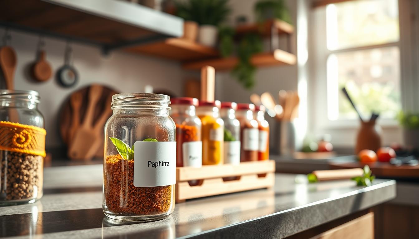
You rely on your label to be the first visual handshake between your product and a consumer. Perfectly aligned means level, centered, with consistent margins and clean edges that read well from the shelf and up close.
This short how-to guide shows you the measuring steps, reference points, and repeatable methods that make aesthetic label placement consistent across every unit. You’ll get practical checkpoints that save time and cut rework.
Small misalignment is easy to spot and can hurt perceived quality, even when the product inside is excellent. Manual labeling often causes errors and wasted time. More precise processes and simple applicators boost repeatability and shelf appeal.
Across this post you’ll preview a workflow: pre-work (compliance and design), tools, measuring on any container, application technique, and scaling. The goal is a consistent look that earns attention, protects fine detail, and supports your brand in the real world.
Why label placement matters for your brand, customer experience, and purchase decisions
The moment your product sits on a shelf, its visual cues decide whether shoppers stop or scroll past. You have seconds to earn attention, so the way your front panel shows the brand name and main benefit drives engagement.
How first impressions on the shelf shape trust and product quality perception
A straight, centered label signals care and consistency. That neat look builds trust before a consumer reads a single word.
In regulated categories like food and beverage, clear positioning of ingredients and allergens is part of credibility. Poor alignment can make your product seem low quality and hurt repeat business.

Using label visibility to communicate product identity and key benefits fast
When the product type and primary benefit are visible at a glance, customers are more likely to pick it up and consider a purchase. If information wraps awkwardly or hides key elements, shoppers get frustrated and move on.
- Faster shelf scanning: catch attention in seconds.
- Lower hidden costs: fewer returns and less rework across an order.
- Stronger branding: consistent position creates a uniform look across your range.
Aesthetic label placement: the pre-work that makes alignment easy
Begin with a visibility checklist so critical product details never get lost on curves or seams. Define what must stay readable and where it must live on the container before you mock up any design.

Confirm the necessary information for your industry
For cosmetics and food beverage, keep the product identity, ingredients, net quantity (metric), and any warning statements clearly on the primary panel. Follow FDA rules for cosmetics and make sure elements do not wrap into seams.
Map the primary display panel and viewing angle
Identify the PDP—the face most shoppers will see. Check how products sit on eye-level and lower shelves, then orient the main product name and core benefit to that view.
Use negative space and plan options for different types
Leave breathing room so text reads fast and looks premium. Account for tapered jars, oval bottles, and tubes by planning multiple label options and sizes. Keep a clear internal menu of specs and a single contact owner so placement stays consistent across products and production runs.
- Quick wins: checklist, PDP map, and size variants.
- Why it matters: fewer reworks and consistent shelf presence.
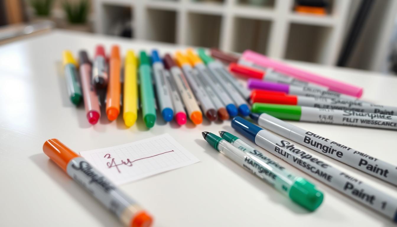
Tools and materials you need for clean measuring and consistent placement
A small set of measuring tools and clear materials rules saves time and rework. Use repeatable methods so everyone on your team gets the same result.
Simple measuring tools for repeatable results
Essential toolkit:
- Flexible tape measure and ruler for flat and curved surfaces.
- Calipers to check diameters and label wrap.
- Fine-tip pencil or grease pencil for temporary marks.
- Low-tack painter’s tape to guide placement without residue.
Choosing materials and finishes that stick and look right
Stock and adhesive matter. Thin paper can wrinkle on curves; thicker stocks resist teeth but may not bend on tight radiuses.
Finishes change both the look and handling. Matte reduces glare; gloss pops color. Protective laminates help with scuffs and moisture.
Why printing quality and service checks impact the final detail
Sharp die-cuts, consistent sizing, and tight registration make alignment straightforward. Ask your print service for proofs, tolerance specs, and pre-shipment quality checks.
Pro tip: For volume runs, applicators cut time and errors. Also consider eco-friendly printing options, like water-based inks, to support brand credibility without losing quality.
How to measure label position on any container
Start by finding stable reference points on the container so each application reads straight and consistent.
Finding straight reference points
Look for mold seams, vertical ribs, cap edges, or a base ring you can always use as a datum. Mark one consistent “front” feature on every product so you and your team align to the same spot.
Setting centerlines and margins
Measure circumference or diameter at the application height and mark the midpoints to create a centerline. Use a short tape hinge to hold the edge while you smooth the rest so the labels stay level and do not rotate.
Choose top and bottom margins that avoid shoulders and curves. Keep negative space consistent so the design and key elements are never distorted.
Building a repeatable guide
Make a simple jig with painter’s tape, a printed alignment card, or a cradle that indexes to your datum. Record height from base, distance from seam, and wrap overlap as a checklist you follow every time.
- Why it matters: consistent measuring saves time and reduces rework.
- Edge cases: for tapered types measure at the label height, not the widest point.
- Result: matching products look premium online and on shelf.
How to apply and align labels without bubbles, wrinkles, or crooked edges
A repeatable, calm routine during application prevents most common labeling mistakes. Start by confirming your reference marks and having all tools at hand. Work on a clean, stable surface and support the container so it won’t roll or tilt while you work.
Dry-fitting before you commit
Dry-fit each label to check centering and level. Align to your marks, lightly tack one edge, then step back and view at eye level.
If the label reads skewed, peel and re-tack. This quick check saves time and prevents rework on sealed units.
Smoothing techniques that protect the design and finish
Apply from the center outward to push air away. Use consistent pressure and move slowly around curves to avoid trapped bubbles.
Use a microfiber cloth, soft squeegee, or gloved hands to smooth the surface. These tools reduce scuffs and keep high-detail printing intact.
Quality checks to catch skew, drift, and inconsistent placement
Use a short checklist every time: eye-level rotation check, top/bottom margin check, seam alignment check, and batch-to-batch comparison.
- Stop the line threshold: define maximum skew (for example, 2 mm) and relabel if it exceeds that limit.
- Common fixes: if edges go crooked, slow down, re-tack, and support the container to eliminate slipping.
- Consistency practices: the same steps every run reduce errors and improve overall quality and customer experience.
Pro tips for scaling your labeling process with better equipment and smarter workflows
A clear upgrade path—from hand application to automated systems—protects your brand as volume rises. Choose the right moment to switch and build simple rules so the change improves speed and quality.
Manual vs. applicator: speed, accuracy, and fewer errors
Manual work fits low runs and tight budgets. At higher output, an applicator increases throughput and reduces customer-facing defects.
When to upgrade
Track units per day, rework time, and error rates. If fatigue or inconsistent pressure causes frequent fixes, invest in equipment.
Standardize team practices
Write an SOP, train everyone on the same reference points, and use a checklist for each order. Consistent practices cut rework and keep the brand looking uniform.
Design, materials, and sustainability
Choose pragmatic label design: consistent margins and real negative space ease application. Use sustainably printed labels with stable stocks and water-based inks to reduce surprises across repeat runs.
- Partner checks: request proofs, confirm dielines, and agree tolerances.
- Single contact: keep one point of contact at your print service for orders and spec updates.
- Customer needs: ask about waterproof, finish, and performance expectations before finalizing options.
Conclusion
Close the loop with a practical, repeatable workflow so your products look the same from batch to batch. Document the pre-work, reference points, margins, application steps, and final checks in a short internal guide.
Run a pilot batch, collect customer and internal feedback, then scale with standardized tools or an applicator when volume grows. Consistent labels and neat placement earn more attention on shelf and lift your brand look.
Use simple metrics—error rate, rework time, and customer notes—to refine materials and processes over time. Keep one clear contact for print specs and store this guide in production resources and the blog so teams stay aligned as you expand into new products.