Script vs block font is more than a style choice when you label real food. You decide between a flowing cursive look and a clean, modern block look. That choice sets the tone for your pantry and daily kitchen use.
Choose cursive if you want a cozy, boutique feel that looks great in photos. Choose a neat block style for fast reading and a minimal kitchen routine.
You’ll learn how each approach affects readability, speed, consistency, and how people in your home actually interact with labels. This matters when you’re cooking or grabbing ingredients in a hurry.
By the end, you’ll get practical examples of cursive and script options, plus block choices that work in jars, bins, and on shelves. You’ll have a clear decision framework to match style, storage, and household habits.
Why typography changes your pantry’s vibe in the present-day kitchen
The words on your pantry labels shape how the room feels every time you open the door. Readable text makes the space feel calm and handled. Hard-to-read cursive or tight lettering creates tiny friction that builds into daily stress.

How you read labels influences how you feel
You usually scan labels from a few feet away and often in dim light. That changes which script or block choices actually work in real life.
Where typography shows up most
- Jar labels and canister decals
- Bin labels and shelf-edge tags
- Pantry door signs where viewing distance matters
Balancing style with function for real people
People in your home include kids learning snacks, guests helping, and busy people rushing morning routines. Aim for function first, style second.
Quick tests—scan time, contrast, and consistent sizing—keep designs beautiful without a lack of clarity. You can keep a cursive moment and still make labels fast to read.
Script vs block font: what each style communicates
A single lettering choice can make your shelves read as handcrafted warmth or sharp efficiency.
Script and cursive fonts at a glance
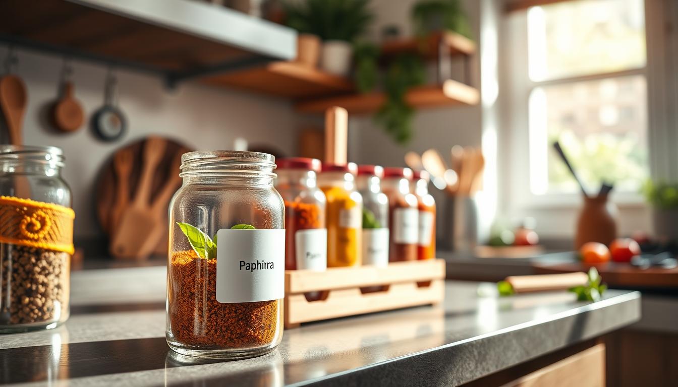
Cursive styles show connected strokes, varied thickness, and a handwritten feel. They signal artisanal, cozy, or vintage personality on jars and labels.
Use cursive where you want charm—like a coffee corner or a baking shelf—when people will pause to enjoy the look.
Block fonts at a glance
Block letterforms are simple and steady. Think even stroke widths, clear shapes, and a modern, minimalist message.
Block choices help when speed matters. They read well from a distance and under dim pantry lighting.

Personality, legibility, and speed
At pantry distance, tight loops in cursive can blur similar letters. Block letters usually keep a- o- e- shapes distinct, which helps quick grabs.
When you have time to admire, cursive adds personality. When you need grab-and-go clarity—weeknights or kids’ snacks—block wins.
Quick evaluation checklist
- Letter spacing: enough gap so shapes don’t merge.
- X-height: taller x-height improves small-size readability.
- Stroke contrast: avoid extreme thin strokes on matte labels.
- Distinct letters: verify a/o/e and i/l look different when small.
Common issues to fix
Watch for lack of clarity (ornate loops), lack of contrast (pale text on pale jars), and lack of consistency (mixing many sizes and styles). Resolving these makes any label system work better.
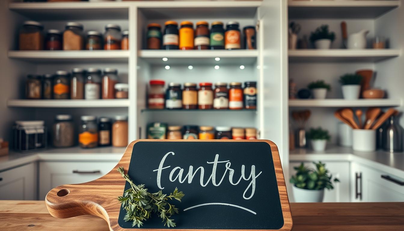
When script fonts work best for pantry labels
Best-fit aesthetics
If you prioritize warmth and charm, flowing cursive choices make jars feel handcrafted and cozy.
Use cursive in farmhouse, classic, boutique, or cozy kitchens where style is a primary goal.
Placement guidance
Give cursive room to breathe. Large jar fronts and canisters are ideal.
- Big glass jars with plain backgrounds
- Canister lids and door signs
- Open display shelves where people pause and enjoy the look
Where it struggles
Avoid cursive on very small labels, all-caps text, patterned containers, glossy surfaces, or long names like “confectioners’ sugar.”
Types, examples, and availability
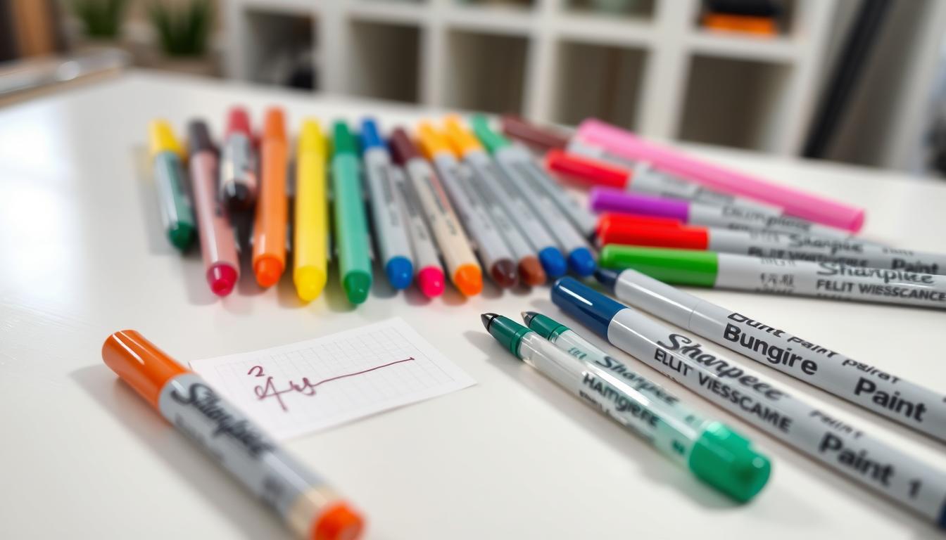
Choose calligraphy for elegance, handwritten for casual warmth, brush for bold character, or old-school for vintage appeal. Test options such as Sloop Script, Thirsty Script, Fairwater Script, Pauline Script, Segoe Script, Aguafina Script, Meow Script, and Luxurious Script.
Licensing note
Many directories mark downloads “free for personal use.” That usually covers your home pantry, but not commercial labels. Always check the license before printing for business use.
When block fonts are the better choice
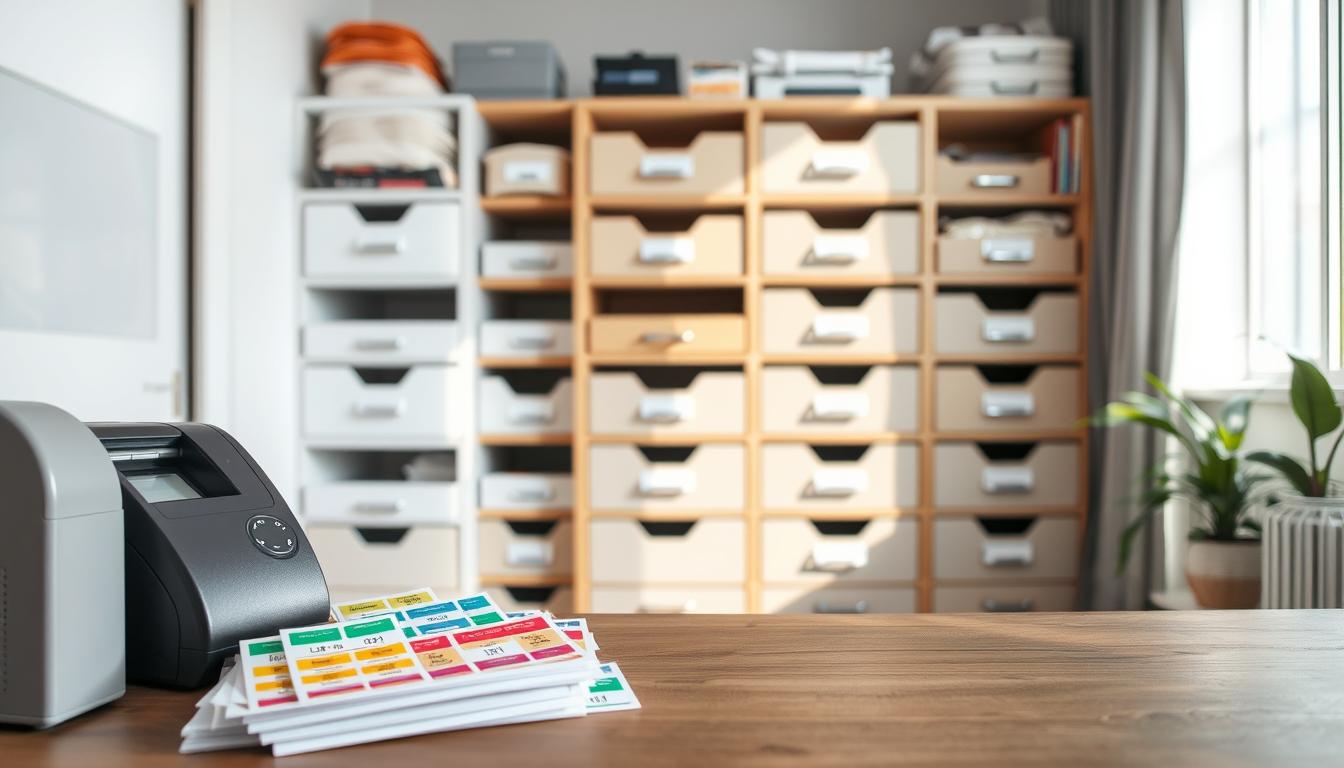
For fast grabs and clear organization, many homes default to clean, block-style labels. They deliver quick recognition and predictable results when you print small tags for jars and bins.
Best-fit aesthetics
Modern, Scandinavian, industrial, and high-contrast kitchens pair naturally with simple letterforms. Black-on-white or white-on-black systems feel intentional and calm on open shelving or metal racks.
Accessibility for every household member
Block letters help kids, guests, and aging eyes scan shelves fast. In dim or angled light, steady shapes reduce mistakes and speed up your routine.
If several people share the pantry, clear labels cut confusion across languages and habits.
Design tips so simple type feels warm
- Use hierarchy: bold for category, regular for details.
- Add subtle tracking and a thin border for polish.
- Pair small icons with text instead of switching to cursive everywhere.
Speed guideline: when you’re cooking under time pressure, simple labels lower the risk of swapping baking soda for baking powder. Keep the working labels clear and reserve decorative lettering as an accent.
Conclusion
Decide on labels by testing what people actually read at arm’s length and in low light. Pick cursive when you want personality and have enough label space to keep letters open. Use plain script or block for high-traffic shelves where speed matters.
Rule of thumb: use block for everyday staples and frequent-use bins; reserve cursive and script for larger signage or decorative categories. Try a quick trial—print a sheet, stick labels on jars, then view from your normal standing spot.
Keep a consistent system across zones. You can mix styles: let cursive add vibe while script or block handles the function. That balance makes your pantry both beautiful and easy to use.